Let’s delve into the captivating world of the Cool Summer color palette.
Here at Spotted Line, we’re dedicated to helping you put your best foot forward, which means steering clear of certain shades that might not harmonize with your natural beauty.
Join us as we unravel the mystery of the “Cool Summer Color Season Worst Colors” and empower you to curate a cool summer color palette that truly dazzles!
Spoiler alert: all of these colors on the do not wear list for cool summers can be found in the flames of a cozy warm firepit – think warm reds, yellows, and oranges.
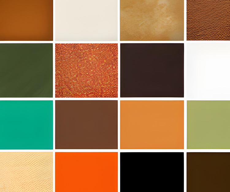
What are the Worst Colors for The Cool Summer Color Season?

While embracing your ideal color palette is vital, it’s equally crucial to understand the shades that may not flatter your Cool Summer undertones.
Cool Summers are fortunate to have an array of stunning hues that enhance their complexion, but a few colors could potentially throw a beauty curveball.
Fear not! We’re here to shed light on these less-than-ideal shades. Below, discover the colors to avoid:
- Tangerine Orange: The warm undertones clash with cool colors and can create visual discord.
- Fiery Red: Its warmth contrasts sharply with the cool hues and might create an unsettling effect.
- Vibrant Yellow: The intensity of bright yellow can clash with the serene nature of cool colors.
- Goldenrod Yellow: The richness of goldenrod may conflict with the calming nature of cool colors.
- Brick Red: The earthy warmth of brick red can create an abrupt contrast with cool shades.
- Sunset Orange: Its warm, fiery tones can compete with the tranquil cool colors, causing imbalance.
- Tomato Red: The strong presence of tomato red can disrupt the soothing effect of cool colors.
1. Tangerine Orange and Sunset Orange
Wearing Tangerine Orange and Sunset Orange when you have a Cool Summer color palette can make you look sickly and tired.
*As an Amazon Associate, we earn from qualifying purchases at no additional cost to you.
These warm-toned oranges clash with the cool undertones of the palette, causing your complexion to appear uneven and potentially sallow.
This clash can also draw attention to any tiredness around the eyes, making them seem fatigued and lacking their usual brightness.
Moreover, these warm oranges diminish the natural vibrancy that Cool Summer individuals exude, making them appear less healthy and radiant.
The contrast between warm and cool tones disrupts the overall harmony of the appearance, leading to an unbalanced and uncomfortable effect.
Ultimately, opting for colors that align with your Cool Summer palette will help you achieve a more flattering and vibrant look.
Other Warm Orange Shades to Avoid
- Pumpkin Orange: A warm and earthy orange reminiscent of autumnal hues.
- Apricot: A softer and muted warm orange with a touch of subtlety.
- Terracotta: An earthy and warm reddish-orange that adds warmth to a palette.
- Burnt Orange: A deep and rich warm orange with a slightly burnt appearance.
- Copper: A metallic warm orange with reddish undertones, often associated with elegance.
- Cantaloupe: A soft and light warm orange, akin to the hue of the fruit.
- Honey: A warm, golden-orange shade that radiates warmth and richness.
- Amber: A warm and golden orange with a touch of brown, resembling the gemstone it’s named after.
- Peach: A delicate and soft warm orange with a hint of pink, offering a gentle and flattering tone.
- Rust: A deep and warm reddish-orange that adds depth and intensity to a palette.
- Ginger: A warm and spicy orange with hints of brown, reminiscent of the spice it’s named after.
- Carrot: A bright and lively warm orange, similar to the vibrant color of the vegetable.
2. Fiery Red, Brick Red, and Tomato Red

Fiery red, tomato red, and brick red just don’t play well with the Cool Summer color palette. You see, Cool Summers are all about those cool bluish and grayish undertones in their color choices.
But these warm red shades? They’re all about orangey or brownish undertones, creating this clash that’s a bit like mixing oil and water.
Now, picture this: when you wear these warm reds as a Cool Summer, it’s like your complexion suddenly hits a rough patch. They can make your skin tone look a bit uneven or even a touch sallow.
Plus, the contrast between these fiery reds and the cool palette’s vibes can make your whole look feel out of balance.
Your eyes might even look a bit tired under the weight of these warm shades. It’s like trying to fit a square peg into a round hole – it just doesn’t quite work.
All in all, these warm reds can mess with the cool and calming effect that Cool Summers are all about, leaving you with an appearance that’s less vibrant and fresh than you’d like.
Other Warm Red Shades to Avoid
- Crimson: This deep and warm red clashes with the palette’s intended subtlety and harmony.
- Rust: The rich and warm tones of rust disrupt the cool and calming effects of the Cool Summer palette.
- Cherry Red: The boldness of cherry red can overwhelm the softness of the palette’s colors.
- Coral Red: The mixture of warm and cool undertones in coral red clashes with the palette’s cool undertones.
- Fire Engine Red: The fiery intensity of this red can overshadow the palette’s desired tranquility and balance.
- Burnt Sienna: The warm and earthy tones of burnt sienna conflict with the palette’s soothing hues.
- Cinnamon Red: The warm and spicy undertones of cinnamon red disrupt the cool and refreshing vibe of the Cool Summer palette.
3. Vibrant Yellow and Goldenrod Yellow

For Cool Summers, steering clear of Vibrant Yellow and Goldenrod Yellow is a smart move.
These shades clash with the Cool Summer palette’s cool undertones, and that can spell trouble for your look.
When you rock Vibrant Yellow or Goldenrod Yellow as a Cool Summer, they can wash out your complexion and make your skin tone appear uneven or even a bit dull. These warm yellows don’t vibe well with your natural coolness, and that’s when things start to feel off.
Imagine this: you’re trying to create a chill, calm vibe with the Cool Summer palette, but then you introduce these bright and warm yellows. It’s like trying to mix oil and water.
Instead of that fresh and serene appearance that Cool Summers aim for, you might end up looking a bit tired and off-balance.
These yellow shades pull the focus away from your natural beauty, and your face might lose some of that lively and bright quality you’re going for.
So, it’s all about avoiding these warm yellows to stay in sync with the cool and calming vibes of the Cool Summer palette.
Other Warm Yellow Shades to Avoid
- Sunshine Yellow: Its warm and bright tones clash with Cool Summer’s cool undertones, creating an unflattering contrast.
- Lemon Yellow: This vivid warm yellow can overpower the palette’s intended soft and serene effect.
- Mustard Yellow: The earthy warmth of mustard yellow contradicts the palette’s cool and fresh appearance.
- Amber Yellow: The warm undertones of amber yellow disrupt the palette’s desired balance and harmony.
- Honey Yellow: The golden warmth of honey yellow clashes with the cool undertones of the Cool Summer palette.
- Butterscotch: The warm and caramel-like tones of butterscotch contrast with the palette’s soothing cool hues.
- Wheat Yellow: This warm yellow shade can make your skin tone appear uneven and dull against the cool undertones of the palette.
- Dandelion Yellow: The brightness of dandelion yellow can feel jarring when paired with the soft and muted tones of the Cool Summer palette.
- Golden Yellow: The richness of golden yellow can disrupt the palette’s calming and serene effects on the complexion.
- Saffron Yellow: The warm and intense undertones of saffron yellow clash with the palette’s desire for a cool and balanced appearance.
Conclusion: Cool Summer Worst Colors
In summary, Cool Summers should avoid warm oranges, yellows, and reds due to the clash between these warm shades and the cool undertones that characterize their color palette.
Incorporating these warm colors can disrupt the palette’s intended harmony and balance, resulting in an unflattering appearance.
These shades can accentuate any cool undertones in the complexion, leading to an uneven or sallow appearance and potentially diminishing the natural vibrancy of the eyes.
By refraining from wearing warm oranges, yellows, and reds, Cool Summers can maintain the serene and soothing qualities of their palette, allowing their cool undertones to shine through for a more harmonious and appealing overall look.