
Understanding warm vs cool colors is key to mastering your most flattering colors.
In the world of color season analysis, you’ll often hear colors referred to as warm or cool.
*As an Amazon Associate, we earn from qualifying purchases at no additional cost to you.
This post will help you understand the key differences of warm colors vs cool colors.
What are Warm and Cool Tones?
Warm and cool tones refer to color characteristics and their perceived temperature.
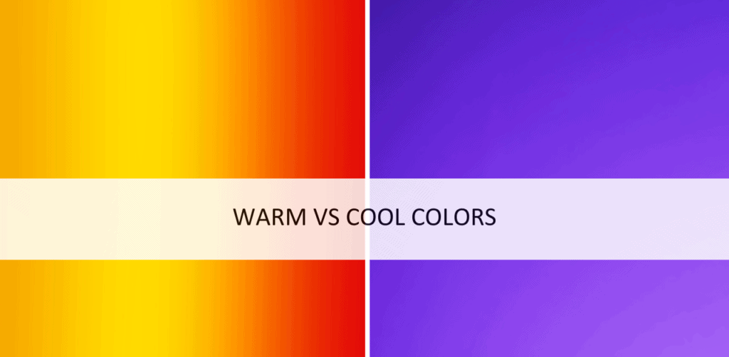
Blue is the easiest cool tone to remember based on temperature. Think of cool blue water and cool blue skies.
Orangish red is the easiest warm tone to remember based on temperature. Think fiery flames with the combination of yellows and oranges added to red, or a hot coil on your stove top.
Warm Colors

Warm colors are often associated with heat, sunlight, and fire.
They evoke a sense of warmth, energy, and coziness. Common warm tones include reds, oranges, yellows, and browns.
Warm, fall-like colors are most flattering on people who also have natural warm coloring. For example reddish or golden tints in their hair, skin, and eyes.
List of Warm Colors
Warm colors are often associated with heat, fire, and sunlight, and they tend to evoke feelings of energy, passion, and warmth. Here is a list of commonly recognized warm colors:
- Red
- Orange
- Yellow
- Coral
- Vermilion
- Tomato
- Maroon
- Burnt Sienna
- Rust
- Amber
- Gold
- Peach
- Salmon
- Terracotta
- Cinnamon
- Mahogany
- Brick
- Bronze
- Caramel
- Mustard
- Paprika
- Apricot
- Tangerine
- Copper
- Rusty brown
These colors range from deep, rich shades to lighter, more vibrant tones, but they all fall within the warm color spectrum.
Cool Colors

When it comes to warm vs cool colors, cool colors are often associated with water, ice, and the sky. They evoke a sense of calmness, tranquility, and serenity. Common cool tones include blues, cool greens, and purples.
Cool colors are typically most flattering on those with ashy hair tones and cool blue, green, or black colored eyes.
List of Cool Colors
Cool colors are generally associated with calmness, tranquility, and a sense of relaxation. The most commonly recognized cool colors are:
- Blue
- Green
- Purple
- Turquoise
- Aqua
- Teal
- Cyan
- Indigo
- Mint green
- Lavender
- Sky blue
- Slate gray
- Periwinkle
- Powder blue
- Ice blue
- Seafoam green
- Steel blue
- Mint blue
- Cornflower blue
- Lilac
These colors can evoke feelings of serenity, peace, and a refreshing atmosphere. However, it’s worth noting that color perception can vary depending on cultural and individual preferences.
Warm vs Cool Colors: Saturation and Brightness
It’s important to note that warm and cool tones can also be influenced by other factors such as saturation and brightness. Additionally, cultural and personal associations with colors can vary, leading to different interpretations and emotional responses.
What is Color Saturation?
Color saturation refers to the intensity or purity of a color. It measures the degree to which a color appears vivid, vibrant, or intense. When a color is fully saturated, it appears in its purest form, without any dilution or addition of white, black, or other colors.
Saturation is often described using a scale ranging from 0% to 100%. At 0% saturation, a color becomes completely desaturated and appears as grayscale. As saturation increases, the color becomes more intense and vibrant, reaching its peak saturation at 100%.
Adjusting the saturation of an image or a color allows for creative control over its appearance. Increasing saturation enhances the vividness and richness of colors, making them more vibrant and eye-catching. Conversely, reducing saturation results in muted or pastel-like tones, creating a softer or more subdued effect.
What is Color Brightness?
Color brightness refers to the perception of how bright or light a color appears to the human eye. It is a subjective measure of the intensity or luminance of a color, and it is influenced by various factors such as the amount of light reflected or emitted by an object or surface, as well as the sensitivity of the human visual system.
In technical terms, color brightness is often described using numerical values that represent the relative intensity of the color. These values can be obtained using different color models, such as the RGB (Red, Green, Blue) or HSL (Hue, Saturation, Lightness) models.
In the RGB color model, each color is represented by a combination of red, green, and blue values ranging from 0 to 255. The sum of these values determines the overall brightness of the color. For example, a color with RGB values of (255, 255, 255) represents pure white, which is considered the brightest color, while (0, 0, 0) represents pure black, the darkest color.
In the HSL color model, the lightness component represents the perceived brightness of a color. It is represented by a value ranging from 0 to 100, where 0 represents black and 100 represents white. This model allows for easier manipulation of brightness levels while maintaining the hue and saturation of a color.
Conclusion: Warm vs Cool Colors
The easiest way to decipher warm vs cool colors is to think of them in terms of temperature.
Colors associated with warm can be found is fiery flames and golden deserts.
Colors associated with cool can be found is cool blue water and ice.