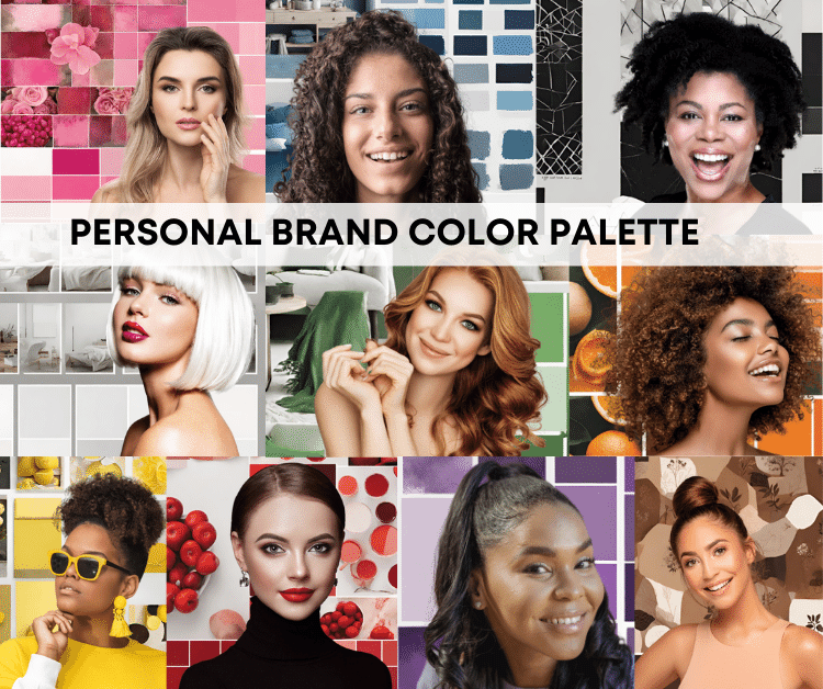
Your personal brand color palette should communicate who you are seamlessly and consisitently.
These colors are not just about looking nice; they’re about expressing who you are and making a positive impact.
Creating your personal brand color palette doesn’t need to be complicated—it’s about feeling good, looking good, and doing good.
In this blog post, we’ll break it down into three simple steps.
Let’s dive into the world of colors and discover how your unique palette can tell your story and bring some good vibes to the world.
3 Steps to Your Personal Color Palette

There are three simple steps to follow when deciding which colors will represent your personal brand best.
These three steps are intended to make you stop and think for a moment about exactly who you are as a brand and which parts you want to continue to grow.
These are the three steps to building youe personal brand color palette:
*As an Amazon Associate, we earn from qualifying purchases at no additional cost to you.
1. Start with the colors that look best on you.
2. Pick the “feeling” you want your colors to convey.
3. Make sure the colors work well together.
1. Pick The Colors That Look Best On You
Alright, let’s chat about picking your personal brand colors—it’s all about making you the star!
Start by choosing colors that feel right for you and enhance your style. Think about your skin tone, hair color, and what you personally love.
You’re the center of this brand, so everything should revolve around highlighting your unique features. Check out color seasons like spring, summer, autumn, and winter—find the one that suits you best.
Use the recommended color palettes for your season, creating a brand that’s all about colors that complement and enhance your natural vibe.
Keep it centered on you, and you’ll end up with a color palette that not only looks good but also speaks volumes about the real, authentic you.
2. Pick Colors That Feel The Best For Your Brand

Picking colors for your brand is more than just choosing what looks nice – it’s about understanding how colors make people feel.
Colors have vibes, and this is where color psychology comes in. For example, warm colors like red show energy, while cool ones like blue give off calm vibes. By picking colors that match how you want your brand to feel, you create a connection with people’s emotions.
It’s like speaking a silent language that makes your brand not just seen but felt.
So, when you’re choosing colors, think about the feelings you want your brand to evoke, and you’re on your way to making a lasting impression.
Red

Color Psychology of the Color Red:
- Positive Associations: Energy, passion, love, courage.
- Negative Associations: Anger, aggression, danger.
Personal Brand Statement for the Color Red:
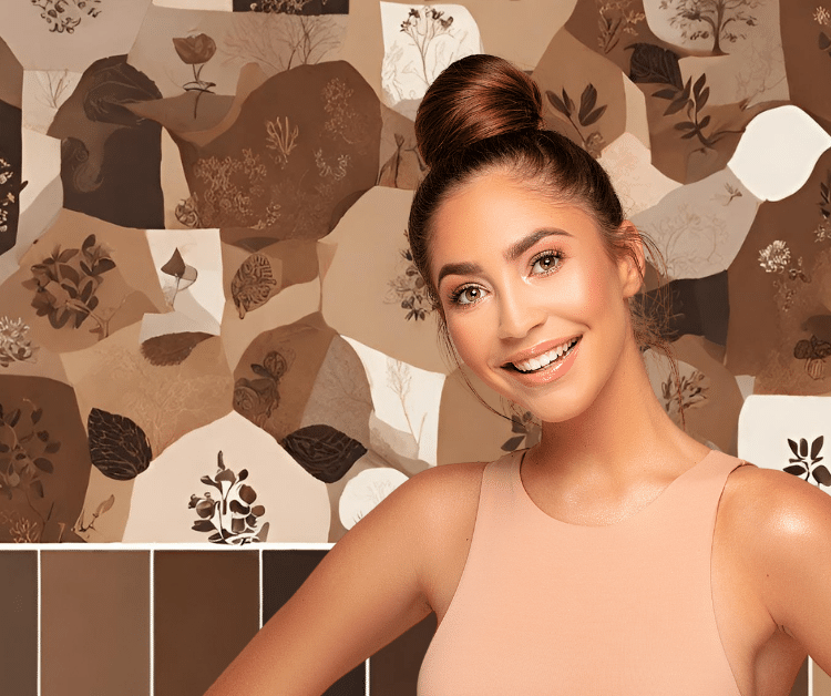
“I am a strong woman, and my personal brand speaks volumes in the bold and passionate language of red, the color in which I look and feel my absolute best, harmonizing seamlessly with my natural coloring. Rooted in the warm hues of Soft Autumn, my presence exudes high energy, courage, and an unwavering commitment to authenticity.”
Blue

Blue:
-
- Positive Associations: Calmness, trust, reliability, professionalism.
- Negative Associations: Coldness, sadness.
Personal Brand Statement for the Color Blue:
“My leadership style is recognized for its calm, cool, and comfortable demeanor, and the color blue perfectly aligns with my overall essence. Moreover, it gracefully complements the captivating beauty of my stunning grayish-brown eyes and cool skin tone.”
Green

Green:
- Positive Associations: Nature, growth, harmony, freshness.
- Negative Associations: Envy, inexperience.
Personal Brand Statement Using the Color Green
“A lively green, echoing the intensity of my fierce green eyes and complementing the warmth of my fiery red hair, defines my dynamic personal style. Rooted in nature’s beauty, it symbolizes growth and freshness, embodying my vibrant and ever-evolving presence.”
Yellow

Yellow:
-
- Positive Associations: Happiness, optimism, warmth, energy.
- Negative Associations: Caution, anxiety.
Brand Statment for Yellow
“Radiant and cheery, I feel most alive in the color yellow, a shade that beautifully complements my natural golden undertones. Rooted in positivity, happiness, and genuine warmth, my brand is designed to evoke these same feelings, inviting you to share in the vibrant energy and uplifting spirit it embodies.”
Purple

Purple:
- Positive Associations: Luxury, creativity, royalty, sophistication.
- Negative Associations: Mystery, moodiness.
Personal Brand Statement Around the Color Purple:
“My personal brand revolves around celebrating and envisioning life’s finer things. The regal and luxurious hue of purple captures my mission to empower women, making them feel like the queens they truly are.”
orange
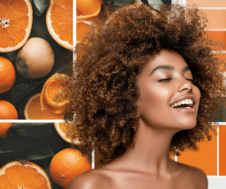
Orange:
- Positive Associations: Enthusiasm, warmth, creativity.
- Negative Associations: Aggression, impulsiveness.
Personal Brand Statement Centered Around the Color Orange
“In the essence of my personal brand, creativity and brightness take center stage. The lingering scent of citrusy orange becomes almost tangible, marking the air as creativity builds up and infuses a vibrant energy into everything around.”
Pink
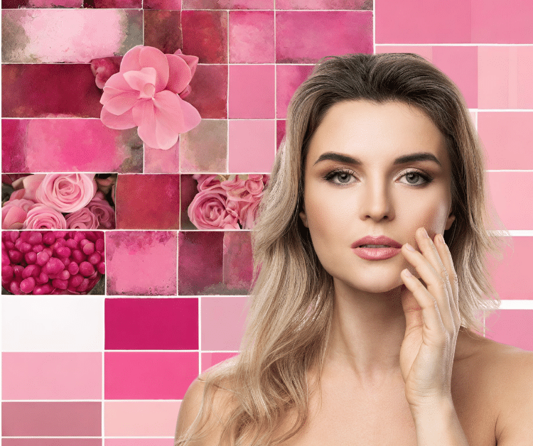
Pink:
- Positive Associations: Sweetness, romance, kindness.
- Negative Associations: Immaturity, weakness.
Pink Personal Brand Statement
“I believe in embodying both soft and fiercely strong qualities, and the color pink, for me, strikes that perfect balance—not too bold, not too neutral. It represents everything I celebrate: kindness, romance, and sweetness, encapsulating a harmonious blend that resonates with my personal brand.”
Brown
Brown:
- Positive Associations: Stability, reliability, earthiness.
- Negative Associations: Dullness, boredom.
Personal Brand Statement for Brown:
“My brand, inspired by Mother Nature, embraces the comforting and grounding vibes of brown. Like the earth beneath our feet, it represents stability, reliability, and natural beauty. In every shade, brown tells a story of connection and enduring strength, weaving together the threads of life.”
Black
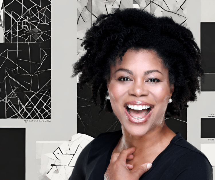
Black:
- Positive Associations: Sophistication, elegance, formality.
- Negative Associations: Mourning, darkness.
Personal Brand Statement around the Color Black:
“My brand is all about the timeless charm of black—classic, elegant, and always in style. Like a blank canvas, black brings versatility and strength to everything it touches, reflecting my commitment to enduring beauty and timeless appeal.”
wHITE
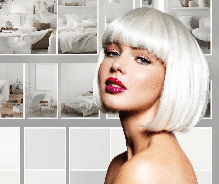
White:
- Positive Associations: Purity, simplicity, cleanliness.
- Negative Associations: Sterility, emptiness.
“My brand is all about the timeless charm of black—classic, elegant, and always in style. Like a blank canvas, black brings versatility and strength to everything it touches, reflecting my commitment to enduring beauty and timeless appeal.”
3. Make Sure The Colors Work Well Together

When building your personal brand color palette, it’s crucial to ensure that the chosen colors work harmoniously together.
Think of it like creating a visual symphony – each color playing its part to enhance the overall composition. Consider factors like contrast, balance, and the emotions each color brings. Aim for a cohesive and pleasing combination that not only reflects your personality but also ensures readability and recognition.
Testing your colors in various combinations helps guarantee that your brand remains visually appealing across different platforms and materials. The key is to strike a balance that resonates with your style while maintaining a professional and polished appearance, ensuring that your brand colors not only look good individually but also create a unified and impactful visual experience.
Conclusion: Personal Brand Color Palette
In the world of choosing colors, the possibilities are wide and varied.
Whether you’re into the lively mix of analogous colors, the bold match-ups of complementary ones, or the simplicity of sticking to shades of a single color, there’s a palette for everyone.
Nature-inspired combos, neutral blends, and jewel tones bring their own flair, while pastels offer a softer touch. Beyond the looks, though, colors speak a language of emotions and identity.
So, as you pick your personalized palette, think about what truly reflects you. Find the colors that resonate with your essence and make a statement about who you are.
After all, your personal brand should feel authentically and uniquely